
ground is black and this shows the contrast between good and evil and represents the killer and the victim. The connotation of the colours show that there is innocence and purity which juxtaposes with the black which implies darkness and death. The white writing is used to stand out against the black background but can also be used to show that the black is overpowering the white which portrays in the film that the killer overpowers the antagonist. The credits also have the colour red in them which portrays death, pain an

The size of the fonts used in Se7en vary from small and large. The company name and the main actors names are significantly larger than the executive producers names and any more actors names that aren't as important. By making some fonts larger than other shows to the audience what is really important within the film and what is least important. The audience take note of the main characters and so their names need to be larger than other actors in the film. This shows their importance within the film but typically in films, the main characters are always well known actors that the audience would probably recognise. This engages the audience into watching the film because if well known actors star in the film, it makes the film more reliable for the audience as they know what the actors are like. The companies name is also in a larger font that other credits because it tells the audience who made the film and commercialises them if the audience think the film is good.
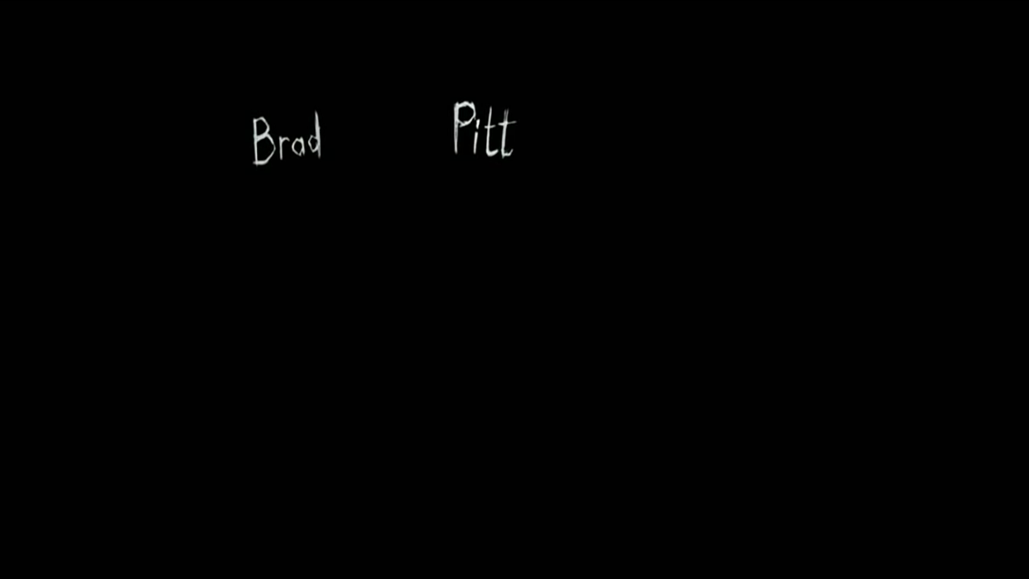 The companies name also represents what the audience expect to see in the film and so the font has to be big so that the audience see it and take note of it. The title se7en is the biggest font and this is because the audience need to know what the film they are watching is actually called and this leads the audience into suspense as to what the film is going to be about. Just like the other opening credits, the title also has jagged writing which creates a sinister effect and builds up tension within the audience as they have no idea what to expect but the jagged writing portrays pain and death which could take place in the film. The title has the number 7 in it which shows a hidden meaning but also portrays instability as the word "Seven" is initially spelt wrong and so this portrays the killer as unstable and maybe messed up which portrays what is going to happen in the film or what the audience can expect to see. In the opening credits, the order of appearance of the credits are, production team, director, main actors, title of the film, other actors, producers, executive producers and director. These credits go in order of importance and this is also shown by the font as well. Director is shown twice because the director is the main person in making a film and so the director has a lot of importance within the film. The audience need to know thr director so that they can associate them with other films and get an insight to what they might be watching or what might appear within the film.
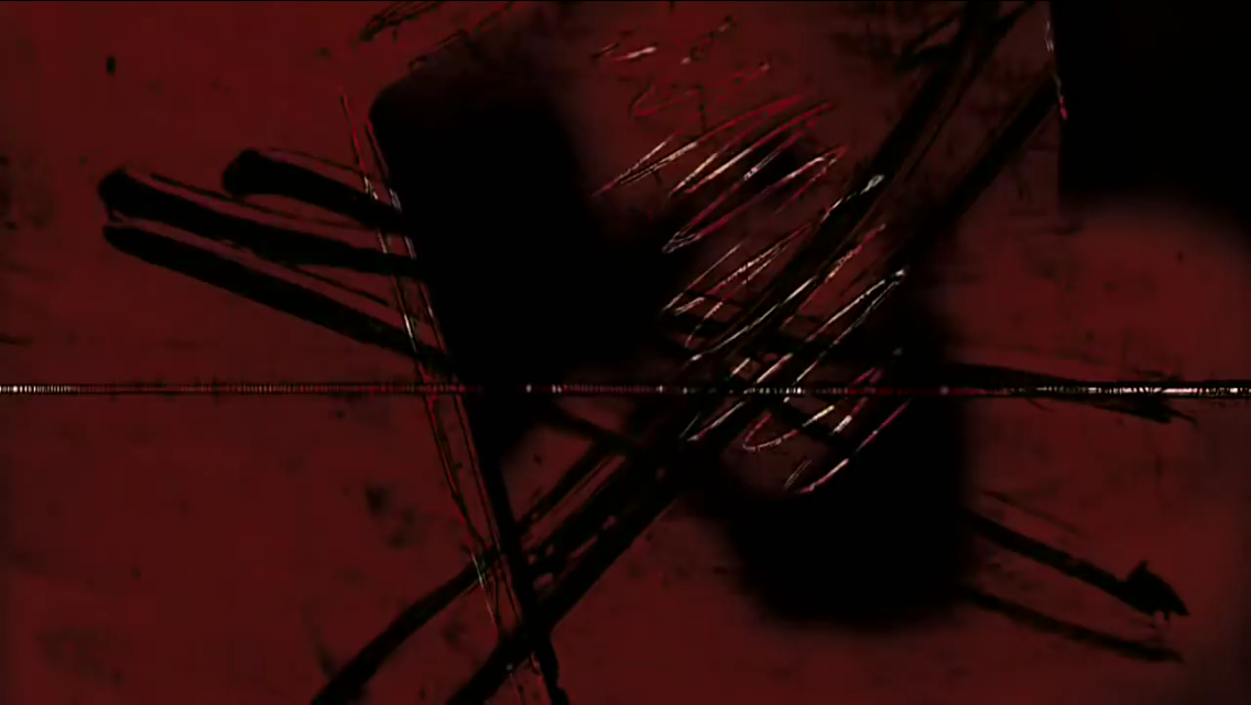
 There are many thriller conventions within this sequence as firstly the killers identity is hidden which creates an enigma as to who the killer is and what they want to do with the victims. By hiding the killers identity it means that the audience are more intrigued into the film as they want to know who it is and so this leaves them in tension. Another thriller convention is that suspenseful music is played over the credits and this portrays both the killer and the victim as different beats are played to represent each character. Suspenseful music gets the audience engaged as they are already lead into the unknown as to what is going to happen during the film. The suspenseful music foreshadows events tht are going to take place within in the film such as a death and pain. This can be implied by the music that is played over the images which portray a death scene. Another convention is that there are images of targeted victim during the opening credits and this makes the audience feel threatened by the killer as there are many targets which the killer wants to murder and this also creates an enigma as to whether the killer id actually going to murder them or not. The audience can
 see what the killer is capable of and so gets them engaged in the film because they know several deaths could take place which makes them worry for the victims that are show to be a target. The last thriller convention is that during the opening credits, blades and sharp objects are shown which foreshadow death and pain. They also relate back to the title of the jagged and slanted writing which portray the sharp objects. These objects are what could be used to kill the victim and this instantly builds a relationship with the audience and the characters and the audience instantly become worried for the victim but also feel threatened by the antagonist. The sharp objects create a sinister atmosphere and make the audience aware of what is going to take place in the film. This is conventional to thriller films as weapons are always used by the killer to murder the victim.

Strengths on this opening credit is that it reflects on my narrative and gives an idea to the audience what is going to be included in my narrative. The opening credits also include conventions of a thriller film which make my sequence seem more intriguing and engage my audience a lot more as they know a death is going to take place. The opening credits also help to create an enigma for the audience as they instantly want to know what is going to happen next and so they would want to watch the rest of the sequence to find out what happens to the victim. My opening credits also set the genre of a thriller sequence straight away through the use of the style of the font which make the credits look disturbed and unstable.
Weaknesses to my work is that my opening credits only consist of two colours which make my opening credits boring. I could add more colours in there such as red which portrays that my sequence is going to include blood and that it is going to be gory. I could also use red show death and pain which instantly makes the audience think that the victim is going to die by the antagonist. The colour red also connotes to a target which implies that the killer could have a target and this is going to be the person that gets killed. Another weakness is that the black screen is going to hide the image behind it and so I would have to get rid of the black in order to see the images and this doesn't make my opening credits seem very conventional and so they might not intrigue my audience to watch the sequence. The audience could also get bored of the opening credits as they are boring and don't thrill the audience. My opening credits are very cliche and so it doesn't make my opening credits original which could also prevent my audience from watching the sequence. My opening credits don't seem unique and are shown with every typical thriller film and so the audience can guess the narrative straight away which would make my sequence boring and not thrilling for the audience.

Weaknesses of John's credits is that the font is very cliché and might not intrigue the audience as much because it isn't original. The actual font style makes the film seem like there is going to be loads of blood and this could be misleading towards the audience because there isn't that many gory scenes but instead it is jumpy. The credits may not engage the audience that much because the audience might expect different narrative to how the actual narrative is going to be and this is because of the gory font that John has chosen. Another weakness is that the credits are going to cover the images that the credits are playing over. Therefore John needs to change the positioning of his font so that it doesn't cover the images.


This is Luca's opening credits. His font is called friday the 13th and his strengths are that the font and style of the font relate to the thriller genre. This is because he used the correct colours for a thriller film because he used the same typical colours of red, white and black. These are typical colours for a thriller film. When the opening credits appear the audience know instantly that they are watching a thriller film. The style of the font used is also sinister and relates to a thriller genre. The font looks like it has almost been scratched and this foreshadows events that are going to happen in the sequence as they imply weapons which are going to be used in the sequence. Another strength is that in his second opening credits, his text is in the bottom right corner which is goo as it won't cover the images that will be played on the screen. This will intrigue the audience to watch the film as they can look at the opening credits while watching the images which will both engage the audience but also thrill them.
Weaknesses of Luca's opening credits is that like my and John's the opening credits are very basic which would create tension for the audience or engage them as much as other opening credits. For his title both the colours are very dark which don't stand out and maybe make it hard for the audience to see what the words say. His credits are very bland and are used a lot in other thriller films and this doesn't make Luca's work original.He also has used a very basic font for his production
s one. The font he has used isn't conventional to a thriller film and so the audience might get confused on whether they are watching a thriller film or not. The font style doesn't foreshadow what events could take place in the film and this means that the audience might not become intrigued into the film. Finally Luca could add some extra colours in there just to make it stand out more. He could add some other darker colours or change the background colour so that the font stands out more and the title can be easily seen. This helps to engage the audience as they are going to want to know what the title of the film is called.

This is Ciara's opening credits and one of her strengths is that she has used a font style which reflects on our narrative. Her font style implies that what the audience are watching is a thriller film and the font style represents that the killer is unstable and disturbed. This is shown through the jagged writing and the way the writing is squished together. She has also used conventional colours of white and black which also represent a thriller film but also the text stands out from the black background and this is good because it means that the audience can read what the text says. This would make the audience more intrigued into the thriller film and make them want to watch the sequence. Weaknesses on Ciara's credits is that her credits aren't completely conventional to the thriller genre because they don't imply to the audience what they might expect to see. The font is very basic and this might not engage the audience because they wouldn't become intrigued into the sequence because they could find it boring. The credits as a whole is quite bland as there are only two colours included which are black and white and this doesn't make it appealing to the audience or engage them into the thriller sequence. The credits don't represent that it is a thriller film because the style font isnt conventional and the colours are quite plain. Ciara's credits are also positioned in the middle of the screen which means that any images played underneath the credits will be blocked and the audience might not be able to see what is happening in the sequence and this will make the audience less likely to watch the film.
As a group I think we are going to mix two ideas together. Firstly I think we should have my font style as the text. This is because my font relates to the narrative of our opening sequence due to the slanted and jagged letters which portray weapons such as knives. This is more relateable to our narrative rather than using a blood style font as this is misleading to the audience because our narrative doesn't include a lot of gory scenes. I would also want to use Luca's positioning for his second opening credits of productions. This positioning is useful within our sequence as it doesn't cover the images that are going to be played under the credits. The positioning is going to be at the bottom so that the audience can still see what is going on at the beginning of the sequence and still become engaged into the film. I am also going to have the font colour as red or white so that it stands out and connotes either death or innocence and this will imply to the audience straight away that they are watching a thriller film. The font colour will also build up tension as it foreshadows what is going to take place in the film and this leaves the audience on edge. As a group we haven't yet decided on a title but we are planning what it might include to get our audience gripped instantly. However our group has decided on order of appearance of the credits and this is going to follow the Se7ens order as we think that it is the most conventional and professional. Our credits will be the companies name, actors names, (antagonist first then the victims) then directors, Title, further actors names, producers, executive producers and then directors.
Actors - John (Antagonist)
Sasha - (victim)
Luca - (Victim 2)
Cameracrew - Luca and Ciara
Directors - John and Luca
Producer - Jamie
Music - Ciara
Costume, hair and makeup - Sasha and Ciara
Executive producer - Harry and Molly
Company name - Suspense Productions
To conclude, opening credits are important when watching a film because they tell the audience what they might expect to see in the film through the companies name and through the use of style of font, colours and positioning of the credits. Opening credits also intrigue the audience into the film by the way that the style of the font is used. For instance in a thriller film the style of font is jagged which intrigues the audience as they know a death is going to take place. Opening credits within a thriller film help to create tension through the connotations of the colours and by the way the text is positioned which could imply instability or weakness. Opening credits in a thriller film is also important because it tells the audience what the title of the film is and the title could also foreshadow what the narrative is about and what the audience might expect to see in it.
This post demonstrates a good understanding why credits are essential to include. You have analysed the Se7en example well and have considered the various ways in which the conventions of a thriller are demonstrated, through the points that you have included on fonts, styles, colours and images.
ReplyDeleteThis post also demonstrates good planning techniques with your group. It is clear to see that you have considered the strengths and weaknesses for the individual ideas, before deciding and selecting one particular style to include.
Aim-
1) Consider your choice of language- consider other ways of analysing a text, instead of writing about it being too cliché